Bad design nearly always comes with follow-up instructions
Over-instruction often betrays poor design, while thoughtful interfaces balance intuitive usability with helpful and relavant guidance.
6 min read
Dec 2020

A lifetime in design warns even the most zealous of design professionals to be wary of dogmas claiming to be universal. I speak from painful personal experience when I say that no sooner has a principle been deemed absolute than a use case emerges which requires us to break it. It turns out the rule wasn’t so unconditional after all.
Two principles which I can stand over as universally relevant are perceivable and predictable. This means that a user should readily understand what an interface offers, and that the interface should behave how the user anticipates. Or to put it in layman’s language, how a user thinks the interface should work, and how it actually works should be the same. A user should be able to guess how the interface works based on a cursory view of it, and be correct.
It is tempting, yet incorrect, to draw the conclusion from this principle that a design should never offer instruction to users. Of course, it’s better for an interface to work intuitively than to require instruction, but it’s just too simplistic and lacking in nuance to claim that instructions are bad in all contexts. The control panel in the cockpit of a Boeing 747 is a magnificent piece of design, and is no less so because the pilots who use it have to go through years of training and instruction before being allowed to do so.
The same is true of a sound mixing desk or an industrial control panel, and in the digital sphere it is true of systems to register for VAT or apply online in real time for a mortgage. In those digital examples, users benefit from, and appreciate, guidance about what specific information is needed and where it can be found. Gentle instruction and guidance are critical in giving the user positive feelings of confidence and control.
Applying the principles of perceivable and predictable is therefore less about the black-and-white rule ‘never instruct the user’ and more about the shades-of-grey principle ‘don’t over-instruct the user’. Bad design is nearly always accompanied by over-instruction, or handwritten signage added after the event.
Simple instruction and helpful guidance are evidence of a thoughtful interface. Over-instruction and patronising reinforcements are more often evidence of a thoughtless one.
For twenty years (and three jobs) I have been a very regular traveller on the Belfast Dublin train. Once a week, every week, I have travelled the 120 miles of track that connects the two cities, and am very appreciative of the strong coffee, hearty breakfast and friendly hospitality of the team on board. On the two-hour journey one occasionally needs to visit the bathroom, which in itself is an event unworthy of comment, except for the fact that such a visit requires the washing of hands afterwards, which in turn requires working out how the interface below operates.

The interface comprises three labels and a button. The three labels are for soap, water and dryer (in English and Irish, and with braille) along with a button just below the dryer. So how does it work? And does it work the way the user expects it to work? Well, I have put these questions to nearly 2,000 people in 15 countries and the most common answers are:
Get soap on hands? Place hands below Soap label.
Get water on hands? Place hands below Water label.
Dry hands? Usually 50/50 between place hands below Dryer label and press button below Dryer label.
The bad news is that these answers are wrong. Worse still, in all my years of asking this question no one has ever got this right. I stress this isn’t because I happen to be hanging around technophobes who are terrified of buttons and automation, but rather because the interface is so appallingly designed. Here are the right answers:
Get soap on hands? Place hands below Soap label.
Get water on hands? Press button below Dryer label.
Dry hands? Place hands below Dryer label.
The correct answer is so awful that, over the years, I’ve sensed people scarcely believe me when I share it. They seem convinced I’ve made it up simply to illustrate the importance of perceivable and predictable.
A number of months ago, the Enterprise (the name of the train service) updated their interface. What’s more, they updated it in a way which confirmed that I wasn’t making it up. Can you spot the difference?
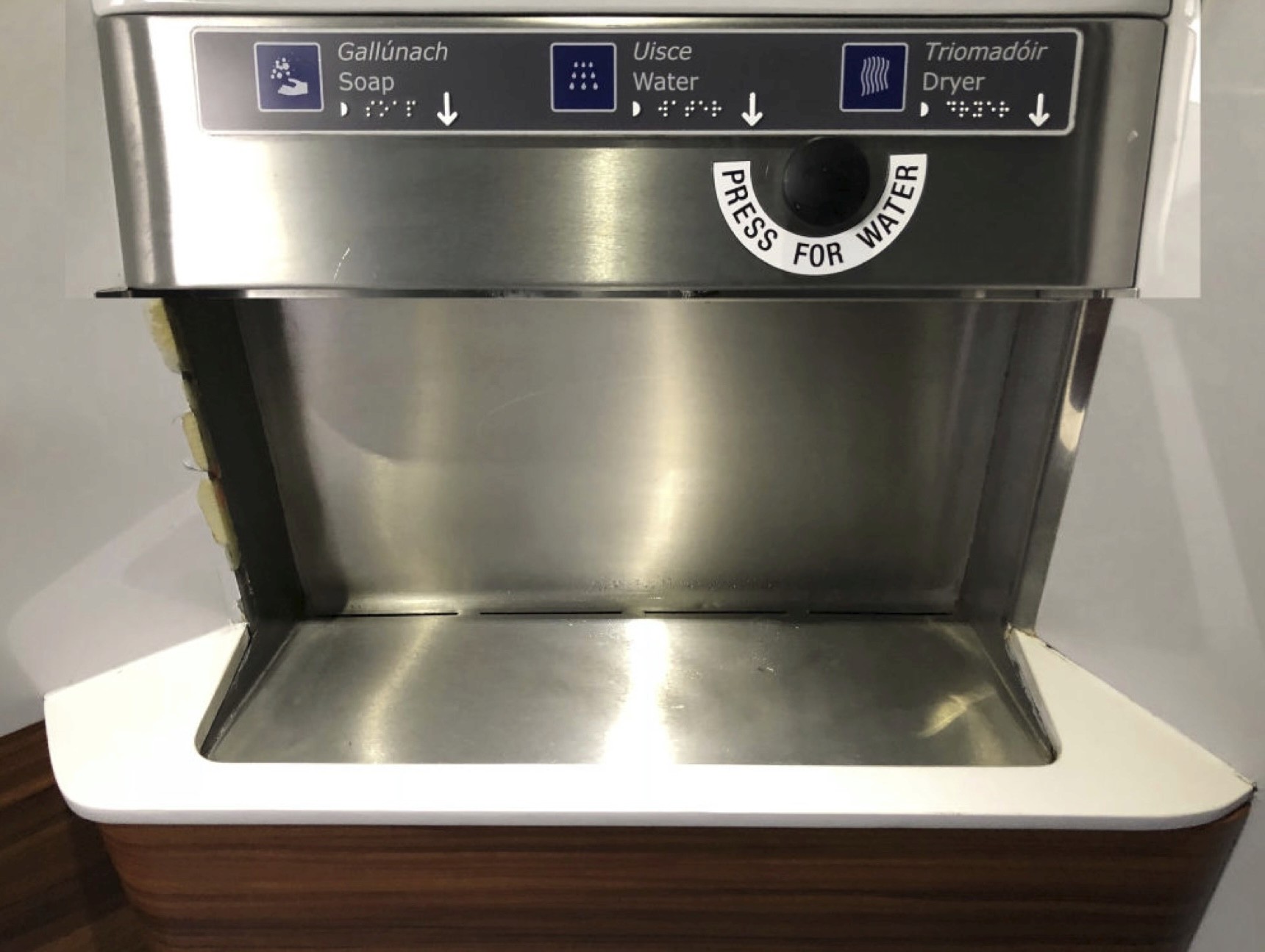
This is an obvious example of a poor interface trying to cover over its crimes with over-instruction. The label is overly large and overly dominant. For nearly fifty years now I have washed my hands 3 or 4 times a day without instruction and the fact that I required instruction here merely illustrates the failings of the interface.
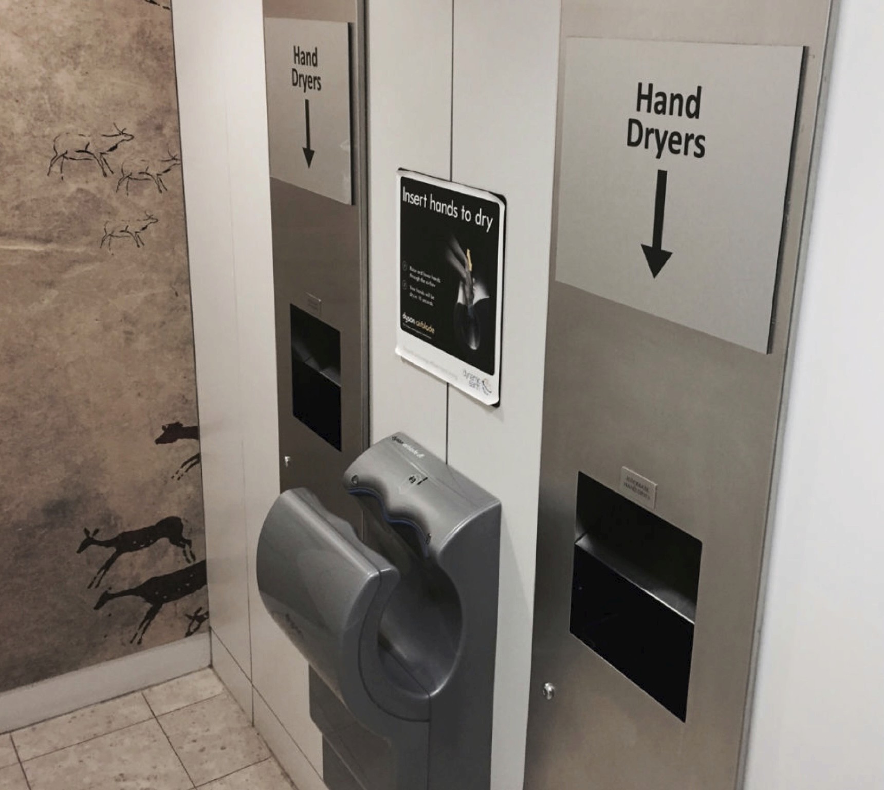
Our friends on the Enterprise aren’t alone in making public conveniences more confusing than they need to be. The otherwise outstanding Dynamic Earth in Edinburgh boasts no fewer than five signs for the dryers in their gents.
Moving to a subject closer to my own heart (and heart rate), let’s consider the interface on coffee machines. As coffee becomes an increasingly prominent part of modern life, we encounter coffee machines more regularly in public environments: from shops to petrol stations, from museums to sports stadia. And here is how we would like them to work:

Press the big button for a cappuccino. Press the other big button for an espresso. And so on.
There’s no way a designer could design such a simple machine so badly that instruction would be required, is there?

OF COURSE THERE IS!
If that signage doesn’t give you a caffeine headache, nothing will. I hope the machine has been upgraded to include an Irish coffee option, to take the edge off the user’s nerves!
There are times, however, when interface quality can be a matter of life and death, or at least a matter of personal safety. One such example is crossing the road. Consider some of the interfaces we encounter when we want to cross the road. One of the many flaws on the interface on the right is that the green man, giving you permission to cross the road, is on the control panel, not on the other side of the road. So, if it’s a busy junction and you aren’t able to see the control panel, you don’t know the colour of the man. What’s worse, if the box is at a crossroads, it is practically impossible to know which direction you’re being given permission to cross. (There’s a small clue on the interface, but I’ll let you find that for yourself.)
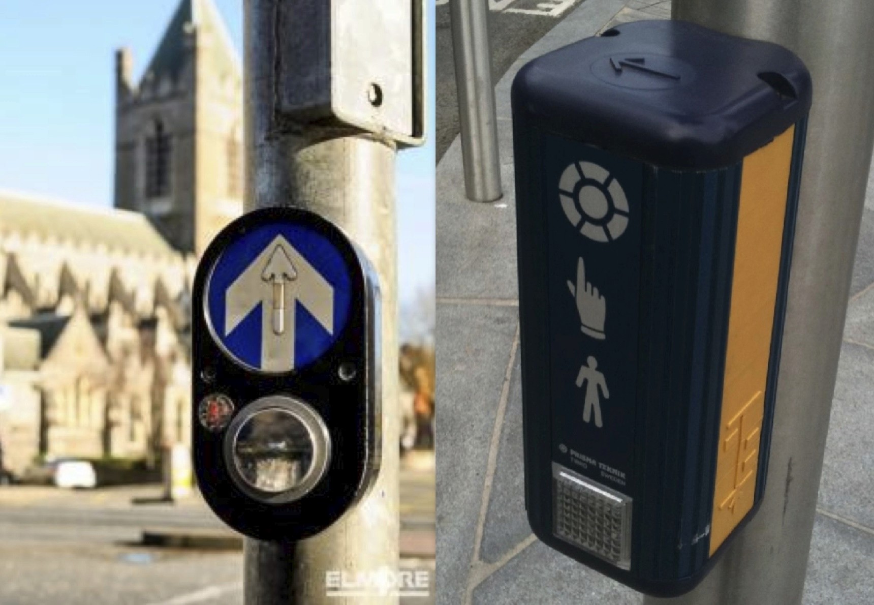
Where interfaces of this low quality appear, over-instructing inevitably follows. See below a control panel and sign from East Belfast.
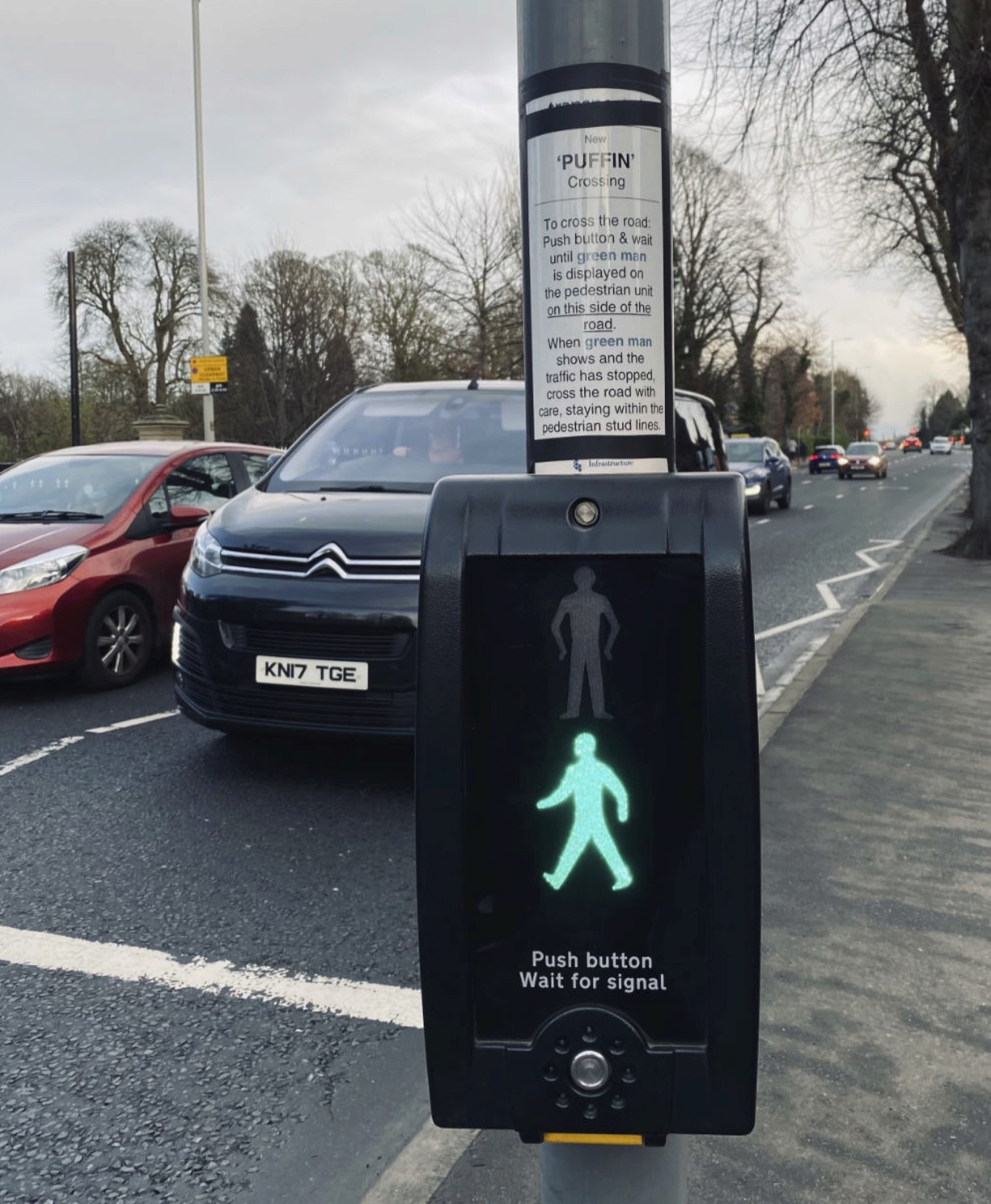
Just pause for a moment to take this in. There are instructions on the post to help people use an interface that used to be usable by 4- or 5-year-old kids. This is an admission of an unacceptably low-quality interface.
To be slightly more serious, ask how the powers that be knew to put the sign up? It can only have been because there have been accidents (or at the least, complaints) near the crossing and so the sign had to be installed, as a chronic confession that the interface simply wasn’t good enough.
It seems the pattern is clear. Simple instruction and helpful guidance are evidence of a thoughtful interface. Over-instruction and patronising reinforcements are more often evidence of a thoughtless one.


